3 Graphs That Prove There’s No Foreclosure Crisis Coming
Here’s the scoop: while the number of foreclosure filings might be inching up, we’re nowhere near a foreclosure crisis.
The market’s stable, buyer demand is strong, and homeowner equity is higher than ever.
Keep calm, carry on, and don’t get scared by any foreclosure headlines – that’s the message to share with your clients right now.
Because this news isn’t going away anytime soon. So, use the insights and visuals in this article to let them know why there’s no cause for alarm.
Foreclosures Have Increased, But Not By Much
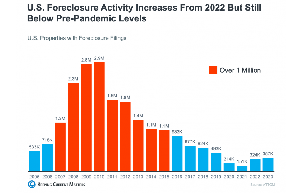
During the Great Recession, millions of homes went into foreclosure. In 2010, there were almost 3 million foreclosure filings in this country.
In comparison, there were only about 357,000 last year.
The graph below shows the number of foreclosure filings going back to 2005 – before the housing crash.
The red bars are when there were over 1 million filings per year. You can see that not only are foreclosure numbers nowhere near where we were during the Great Recession, but they’re also still significantly lower than where they were before the pandemic.
As Rick Sharga, Founder and CEO of the CJ Patrick Company, explains:
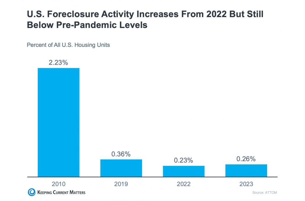
“Foreclosure activity is still only at about 60% of pre-pandemic levels. . .”
Now, let’s focus in on 2020 and 2021. Remember the foreclosure moratorium and forbearance programs during the pandemic? They were lifesavers for millions of homeowners, giving them a chance to bounce back during some seriously tough times.
When those programs wrapped up, it was inevitable that we’d see a bump in foreclosures. But here’s the key point: just because foreclosures are ticking up, it doesn’t mean there’s a crisis or a wave on the horizon.
Just take a look at the graph above to help put that into perspective. We’re still below pre-pandemic numbers and way below the height of the housing crash in 2010.
One of the biggest reasons why is that homeowners are sitting on tons of equity right now. That means that even if they hit challenging times, they have options to use that equity to sell and avoid foreclosure altogether.
This perspective helps people understand why the market today is so much different than back in 2008.
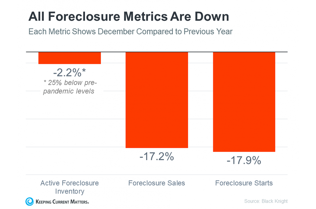
As for what’s happening right now, the graph below says it all. All foreclosure metrics are down. That means active foreclosure inventory, foreclosure sales, and foreclosure starts are lower than they were a year ago.
Therefore, those headlines blowing up your newsfeed are painting a pretty exaggerated picture. They’re cherry-picking recent numbers and comparing them to a time when foreclosures were at an all-time low.
It’s like comparing apples to oranges – not exactly fair, right?
Bottom Line
Headlines have been creeping their way into the news cycle again. They claim that foreclosures are on the rise. The reality, however, is a little more complex.
In the wake of inflation and what have been some tough years for housing affordability, some people want a crash to happen. They’re holding out for that deal of a lifetime.
On the other end of that, anything foreclosure related will immediately put homeowners on high alert. Who wants to sell their house and buy a new one that immediately drops in value?
These visuals and insights help put any fears at ease, letting consumers know there’s no foreclosure crisis on the horizon and therefore, no cause for alarm.
For more insights, context, and tools that will help you explain big market topics like this, you’ll want to try out KCM Membership today.
With it, you’ll have everything you need to effectively communicate what’s happening in the market and empower your clients to make informed decisions that align with their goals.


