A Snapshot of Homeowners [INFOGRAPHIC]
Members: Sign in now to set up your Personalized Posts & start sharing today! Not a Member Yet? Click Here to learn more about KCM’s newest feature, Personalized Posts. |
Members: Sign in now to set up your Personalized Posts & start sharing today! Not a Member Yet? Click Here to learn more about KCM’s newest feature, Personalized Posts. | ![]() |
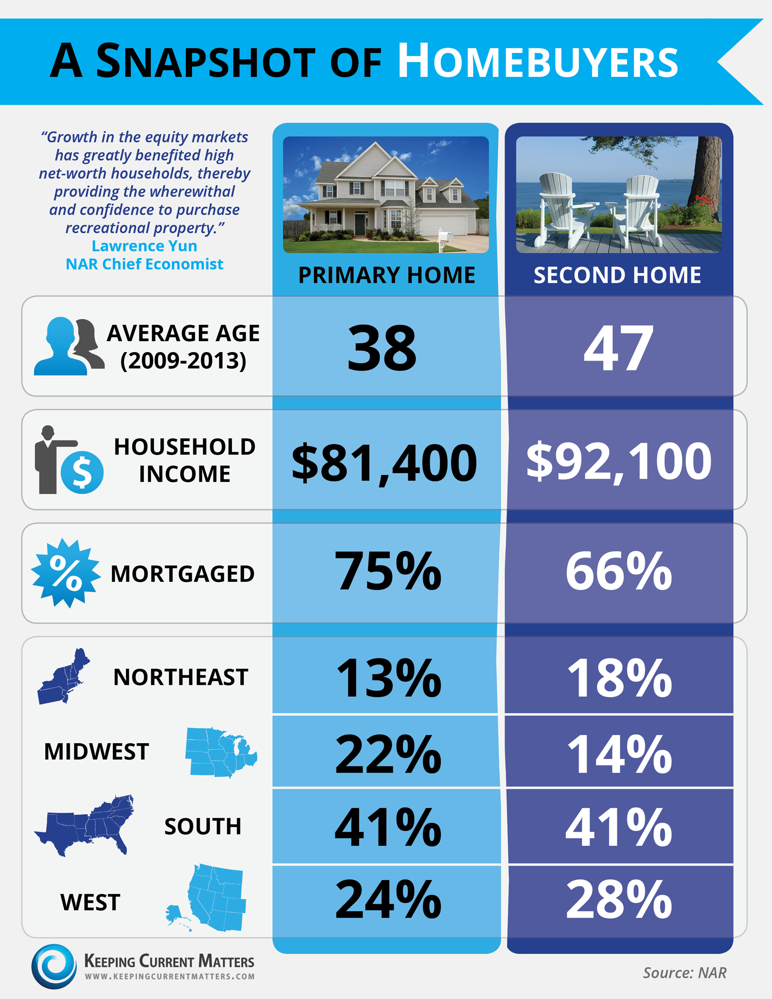
I was taking a look over this info graphic and was wondering if you might clarify the bottom portion. What exactly is the correlation between the various regions and the type of homes?
Great question! The percentages represent the total homes sold in 2013 in each region. The first column is the breakdown of primary home purchases and the next column is second home sales.
So in the northeast the total homes for second and primary are 31%? What was the other 69% of homes sold? Investment? Please clarify so we can explain!
Each column (not row) adds up to 100% of homes sold in each of the two categories (because of rounding up to full numbers, one column adds up to 101%). It then breaks down WITHIN THAT CATEGORY (Primary or Second Home)what percentages were sold in each region.
Hope this helps.